How to Use Color to Create a Happier and More Productive Office
Since at least the early 1800s, scientists and other thinkers have studied the relationship between the colors in our environment and our mood. Today, scientists have developed detailed color-based theories of psychology. With an understanding of those theories, facility managers and designers can choose office solutions and designs that improve employee happiness, wellness, and productivity.
As an example, did you know that bright red hues can increase feelings of aggression and physical restlessness? So, while a bright red wall might be a wise choice for a fitness center, offices should use reds sparingly. On the other hand, studies show that cooler colors like blues and greens can create feelings of peace and contentment.
In this article, we’ll cover some general principals of color use to keep in mind for the office, and we’ll also list the top three colors for boosting office productivity and happiness.
Keep These General Principles of Color in Mind for the Office
The key to using color effectively in the office is understanding the need for a balance between unity and variety. Too few colors or too many dull shades minimize visual stimulation and produce a stifling, energy-reducing effect. But too much color can be obnoxious and distracting.
Most colors are tolerable in small doses. A touch of red here and there can add positive energy to a space. Pillows on couches, accents on desks, and decorations on tables and walls are the easiest places to add bright colors to the office without overdoing it and creating unwanted distractions.
However, there are also a few cautionary guidelines to keep in mind when using color to influence mood and productivity.
Shade, Brightness, and Saturation Levels
Different brightness and saturation levels of a color can have drastically different effects on mood. Brightness refers to the amount of white in a color, while saturation refers to the amount of gray. You might find that a bright shade of red feels distracting, but a shade with less brightness or saturation might provide a feeling of quiet energy without the distraction.
Cultural Meanings
Another factor to consider is that different cultures tend to react differently to certain colors. For instance, the color white often implies purity and peace in Western cultures, but Eastern cultures consider white a color of death and mourning. Purple symbolizes wealth and royalty in both Western and Asian cultures, but for some European cultures, purple is a color associated with sadness.
The Three Best Colors Groups for Office Productivity
1. Blues
It turns out giving your employees the blues can be a good thing! Blue is the world’s favorite color, according to various studies. Studies have shown that shades of blue can have a positive effect on workers, improving:
- Mental alertness
- Attention span
- Intellectual performance
Most cultures and societies consider blue to symbolize quality and trustworthiness, so blue is also an ideal color for spaces that house both employees and potential clients and customers.
Best for: Open office layouts, employee desks, reception areas, and formal meeting rooms
2. Greens
Besides symbolizing health and environmental friendliness, green can have a significant positive effect on mood. Shades of green provide a calming effect and tend to promote creative thinking and brainstorming. Additionally, green is an easy color on the eyes, literally: green tends to minimize eye strain.
Best for: Collaborative areas, meeting rooms, and other shared spaces
3. Off-Whites and Grays
While bright white can feel clinical and monotonous, off-whites and shades of grays help balance brighter, more saturated accent pieces and colors. These subtle colors can:
- Make a space feel larger or more open
- Add a sense of brightness in the absence of natural light
- Induce a feeling of freshness, cleanliness, and harmony
- Invoke concentration and mental quietness
Best for: Open areas, spaces with bright or highly saturated accents, and eating areas
Add Color to Your Office With ZGO Solution’s Colorful Desking Options
ZGO Solutions provides an easy way to add color to your office without having to repaint a single wall or retile any floors. Many of our desk frames are available with trim pieces and privacy screens in productivity-inducing, mood-boosting colors — or your very own custom brand color.
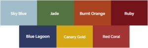
Our Top Seven Favorite Colors for Office Productivity
Ready to get started with your ergonomic and productivity-boosting desk solutions? Contact us today to learn more.
References
Elliot, A. (2015, April 2). Color and psychological functioning: a review of theoretical and empirical work. Front Psychol, 6, 368. doi: 10.3389/fpsyg.2015.00368. Retrieved from https://www.ncbi.nlm.nih.gov/pmc/articles/PMC4383146/
Haworth, Inc. (2019, November 27). The psychology of color: How your palette influences workspace design. Spark. Retrieved from https://blog.haworth.com/content/spark/en/articles/2019/the-psychology-of-color.html
Kurt, S., & Osueke, K.K. (2014, February 28). The effects of color on the moods of college students. SAGE Journals, 4(1). https://doi.org/10.1177/2158244014525423
Tiansheng Xia, T., Song, L., Wang, T.T., Tan, L., & Mo, L. (2016, May 26). Exploring the effect of red and blue on cognitive task performances. Front Psychol, 7, 784. doi:10.3389/fpsyg.2016.00784. Retrieved from https://www.ncbi.nlm.nih.gov/pmc/articles/PMC4880552/
The content provided here is for informational purposes only and should not be construed as legal advice on any subject.